QUIX PIX = CHAT STAT

It had to happen.

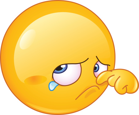
Brands are getting into the emoji business, big time.

These graphics, originally created to add context to text, now live by themselves.  Ford promoted its latest Focus with ‘em.  Unilever’s Dove just rolled out a series of curly-haired faces, customizable by skin tone and hair color.  Domino’s uses its visual as a way to text an order. 

Entrepreneurs are making the most of this emo-design, from a 2013 “translated” edition of Moby Dick housed in the Library of Congress (yeah, called Emoji Dick) to software that suggests emoji as you type.

What’s more, e-statistics are seductive.  As is the psychology behind these hieroglyphics.  Like these:

  • The richer the array of emotions, the happier and healthier the users.
  • People who use emoticons are more popular and influential than those who don’t.
  • Children today recognize corporate logos before they can read.

Now, speaking through pictures is, in short, an almost necessary adjunct to our social media conversations.  Plain language doesn’t cut it anymore.

Perhaps we need to blame Paul Rand who created a rebus of the IBM logo (think:  eye-bee-M).  Or networks like Facebook and Instagram that thrive on communicating in cartoons.  Even Apple which, late last month, announced its first emoji with a cause – against cyber-bullying. 

We have zip against winkies and smileys.  Certainly, as visual communicators, we can’t complain about the explosion of new pictures.  What we miss, really and truly, are the conversations between people, among groups, that rely on faces and sounds and tones and gestures to communicate.

INFO-WHAT?

Software that turns data into charts and graphs is, similarly, transforming the art of presentation, exponentially, day after day.

Classified as business analytics, these tools are now produced by every major and minor e-player, from Microsoft and SAP to Tableau and Tibco, in a market that’s growing faster than the business of design experts.

Which is the issue, as we see it. 

Sure, we have zip argument with the need to pump up nonverbal communication.  After all, stats alone bear out the way we process data:  50 percent of the brain’s real estate either directly or indirectly touches vision.  Eighty percent of us remember what we see and do, versus 10 percent, what we hear, and 20 percent, what we read.

And we’ve been preceded by some pretty smart vis-info practitioners.  USA Today popularized information visuals in its front-page snapshots.  So did modern map-makers.  Edward Tufte, called the daVinci of data by The New York Times, gave us a series of tomes that define exactly how we should use design to communicate information.

We don’t do that. 

Instead, every possible number or word, when grouped, is subject to picture-ification.  Not much time is spent on considering content, comprehension, and communication, in our minds the three critical Cs of what we do.  [Not to mention the changing of behaviors!]

Florence Nightingale, more than a century and a half ago, persuaded Queen Victoria to improve the conditions of military hospitals through a graphic.  What would we say and do today?

PRETTY IS, PRETTY DOES

No, we’re not sexists or anti-feminists.  [Though we do remember all too well the slogan that prompted our headline.]

Our musings this day go to packaging, and why we pay attention to certain things, not others.  The food industry has it made:  They know, for instance, that 64 percent of U.S. consumers buy products from shelves because of packaging.  Drilling deeper, shoppers grab first by color, then by shape, followed by symbols and words.  Even more, the fascination with small versions in re-sealable bags and single-serving multipacks has proven to entice buyers who typically bag 50 items in the same number of minutes in supermarkets.

Overall, much attention is being paid to the Pretty Factor, a phenomenon attributed to Apple (among others).  All aspects of containers matter, whether that’s shape or color, graphics or labeling.

Why, then, do we as communicators, designers, and even marketers tend to ignore the look of the information we send inside and out, to staff, to consumers, to regulators and politicians?  [Omit, if you would, the annual report, the intranet, open enrollment, et al. which historically strut their stuff.]  So:  We’re talking emails, memos, reports, HR information, service and product letters, warranties … the standard stuff that usually gets slapped on a masthead and distributed.  The writing may be catchy and succinct; the message, clear and unadulterated.  Somehow you gotta know that at least 25 percent of recipients will (check one) 1) file it for e-review on a rainy day, 2) toss it in the stack of ‘to-reads’ on a desktop, 3) send it to a colleague with comments or questions, or 4) discard it altogether. 

Compellingness extends, in our opinion, to everything we produce.  Why not help way-overloaded staff who simply don’t have the time to scan their in-boxes … and label (with icons and illustrations) the nice to know, must know, must do items?  Or:  Design an instructions memo typographically, with steps laid out in bold print, no mouse type?  And:  Consider read-able alternatives to the thank you for your response consumer note – a postcard, a note card, even an animated email instead of plain-Jane look and lengthy text?

Pretty-ness, obviously, must be more than skin-deep; user experience work has taught us that much.  [As has life experience.]  What’s your take, dear reader?

WHAT WE LEARNED FROM RETAIL NAVIGATING

 ‘Tis the season for merchandising.

Everywhere, offline and online, retailers are ready for the Black Friday/Cyber Monday onslaught.  In addition to marketing the right products at right prices, stores have figured out their flows … and we don’t mean in the Zen sense.

Since nearly 90 percent of the world’s population is right-handed (and right-footed), carefully designed store trails lead shoppers to turn right, face an aspirational lifestyle display, then continue at 45 degree angles to find stuff.  Wide aisles invite us to walk quickly to our destination; narrow, encourage browsing.  [And clogged?   No one we know would stay long in that store.]  And a well-lit back of the store offers chances for leisurely looking – and much higher price tags.

Other retail strategies are well documented.  Like the shrewd placement of impulse buys (the trendier tchotkes) at the cash register or front counter.  Or attractive window displays with our fave four-letter word … that would be “sale.”  And most definitely, salespeople with smiles who do not ask “how can I help you?”

Holidays are, truly, the best times to be studying retail.  More than random facts and figures, though, are the learnings to be reaped.  Especially for communicators and designers who need to capture the same sort of attention insiders and outsiders lavish on gift-giving and the spirit.

For one, think hard about the paths you provide folks to find your content:  Not too open, not too closed.  Wide aisles, in our universe, equate to a lack of detail and description.  Whereas, narrow  walkways, targeted to the right populaces, will lead to the appropriate info … and rewards.

Two:  Cue ‘em.  Visuals at every point in the journey lure, supplying audiences the crumbs needed to pursue content or collaboration or activities.  [Most of us, when faced with unfamiliarity, prefer clear directions.]

Third (and, yes, there’s more … we’ll beg you to continue this analogy) is understanding our audiences’ EQs enough to not hover, to not fawn, to not be obsequious, but to instead offer guidance and advice while all are finding their ways.

And yes, all good excuses for our continuing to practice visual (and retail) therapy.